Libertine Posted 2 June 2009 Posted 2 June 2009 Hmmm... I'm not sure. Be great without the white bit. Unnecessary IMO.
Fosse Boy Posted 2 June 2009 Posted 2 June 2009 Yeuch. It would be alright with that white V. The collar's quite nice, but what's with this stupid paneled look that a few clubs seem to be going for?
Samilktray Posted 2 June 2009 Posted 2 June 2009 Based on an old kit, and it actually looks exactly the same.
Finchy Posted 2 June 2009 Posted 2 June 2009 I know it's based on an old kit, but that old kit was still horrible then Hate the white bit.
Fosse Boy Posted 2 June 2009 Posted 2 June 2009 Based on an old kit, and it actually looks exactly the same. 1983-85. The white bit on this new one looks massive though. No need.
Fox You Forest Posted 2 June 2009 Posted 2 June 2009 It's no the white that bothers me it's that great line going across the middle.
billyfox1 Posted 2 June 2009 Posted 2 June 2009 It's no the white that bothers me it's that great line going across the middle. Same here. It's like the breast implants on the adidas ones
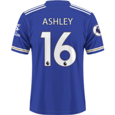
StanSP Posted 2 June 2009 Posted 2 June 2009 It looks like a white t-shirt is underneath the football top, but it's just one top
Guest Bilo Posted 2 June 2009 Posted 2 June 2009 I like it for some weird reason. Awful. One kit that should have stayed in the 1980s.
Craig Posted 2 June 2009 Posted 2 June 2009 Here's the referees: Are they not wearing matching shorts this year then?
Granno Posted 2 June 2009 Posted 2 June 2009 Deary me Everton. That referee's one looks like the shorts don't match too.
DB11 Posted 2 June 2009 Posted 2 June 2009 Are they not wearing matching shorts this year then? Deary me Everton.That referee's one looks like the shorts don't match too. If you look very closely, they didn't on this years Wembley kit either. They're a different gradient of black.
Fosse Boy Posted 3 June 2009 Posted 3 June 2009 Feyernoord kits modified after complaints from fans. Much nicer than what was originally intended to be their 09/10 shirts...
Fosse Boy Posted 3 June 2009 Posted 3 June 2009 Fuck all wrong with the first 1. The Feyernoord fans didn't like the "futuristic lines" below the collar apparently. Good on 'em, power to the fans.
StanSP Posted 3 June 2009 Posted 3 June 2009 http://www.footballshirtculture.com/09/10-kits/ Video on there about R. Madrid's kit. Explains how the crest (left hand side as you look) is made.

Recommended Posts
Archived
This topic is now archived and is closed to further replies.