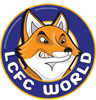
Fox in a Box Posted 18 January 2009 Posted 18 January 2009 Hi Has anyone else noticed that LCFC have tweaked the logo or is it just me? have a look at the splash graphic on the lcfc/tigers statement. It has a fatter font it has lost the two dots to the side and also white chin and ears! Why the hell didnt then do this with a main statement? http://www.lcfc.com/javaImages/1b/17/0,,10274~5248795,00.jpg Being a designer, I think they could have dont a wholesale change but the tweaks do make it look better. Is this the reason for the big sale? old stock etc??
Fosse Boy Posted 18 January 2009 Posted 18 January 2009 Well spotted. Makes the fox look a bit angrier.
Fox in a Box Posted 18 January 2009 Author Posted 18 January 2009 I think they have minamised it as it would cost a fortune to re-apply the stadia with a new logo. 125th year tweak!...marketing dream!?
Guest Posted 18 January 2009 Posted 18 January 2009 Think it was mentioned in the Tigers game change thread. It looks good I reckon
Finchy Posted 18 January 2009 Posted 18 January 2009 I think it looks odd, i know foxes have white on their faces but it kind of looks like it's not been fully coloured in. Also i don't like the look of the text around it, i know it's the same font as before but they've changed something and it doesn't look as good, i think they've made the text smaller and taken away the 2 dots. The changes aren't neccessary really, just don't feel it has as much of an impact.
Shrenchel Posted 18 January 2009 Posted 18 January 2009 Yeah looks alright. Seems a bit pointless, probably cost them a few grand unless Peter Jones did it on Microsoft Paint.
shen Posted 18 January 2009 Posted 18 January 2009 I think it looks odd, i know foxes have white on their faces but it kind of looks like it's not been fully coloured in. Also i don't like the look of the text around it, i know it's the same font as before but they've changed something and it doesn't look as good, i think they've made the text smaller and taken away the 2 dots. The changes aren't neccessary really, just don't feel it has as much of an impact. They've removed the blue inner circle
rmc Posted 18 January 2009 Posted 18 January 2009 I can't make my mind up about it, on one hand i like it because it's different, on another i don't like it because it's different
lavrentis Posted 18 January 2009 Posted 18 January 2009 Yeah I saw it (as mentioned in the other thread ). Looks alright I guess.
Edmund Posted 18 January 2009 Posted 18 January 2009 Yeah looks alright. Seems a bit pointless, probably cost them a few grand unless Peter Jones did it on Microsoft Paint. wouldn't suprise me.
Jimmy Posted 18 January 2009 Posted 18 January 2009 Hi Has anyone else noticed that LCFC have tweaked the logo or is it just me?have a look at the splash graphic on the lcfc/tigers statement. It has a fatter font it has lost the two dots to the side and also white chin and ears! Why the hell didnt then do this with a main statement? http://www.lcfc.com/javaImages/1b/17/0,,10274~5248795,00.jpg Being a designer, I think they could have dont a wholesale change but the tweaks do make it look better. Is this the reason for the big sale? old stock etc?? the current kit is at the end of its 2 year cycle anyway, the new logo was probably planned for a while and introduced to coincide with the new kits
renards Posted 18 January 2009 Posted 18 January 2009 Know a lad whose just had the logo tatooed on his back..fecking massive! If would always change, but not this quick. Rubber anyone?!
Ashley Posted 18 January 2009 Posted 18 January 2009 The Badge looks good I think. Why is the bottom of the Fox White, or is that just me?
Finchy Posted 18 January 2009 Posted 18 January 2009 The Badge looks good I think. Why is the bottom of the Fox White, or is that just me? It's part of the change.
davieG Posted 18 January 2009 Posted 18 January 2009 Can't see why they bothered and if they paid for it - rip off, whatever it cost. I hope they don't come bleating to the fans as to how little money they've got.
Ashley Posted 18 January 2009 Posted 18 January 2009 Hi Has anyone else noticed that LCFC have tweaked the logo or is it just me?have a look at the splash graphic on the lcfc/tigers statement. It has a fatter font it has lost the two dots to the side and also white chin and ears! Why the hell didnt then do this with a main statement? http://www.lcfc.com/javaImages/1b/17/0,,10274~5248795,00.jpg Being a designer, I think they could have dont a wholesale change but the tweaks do make it look better. Is this the reason for the big sale? old stock etc?? No this isnt the reason. Leicester will have a new kit sponser next season and they might have a new main shirt sponser, then again we might not have a new main shirt sponser and the shirt will be left blank for the season.
Miquel The Work Geordie Posted 18 January 2009 Posted 18 January 2009 It looks no better / worse than before. Not fussed.
Samilktray Posted 18 January 2009 Posted 18 January 2009 Does this mean that vile shield design wont be used on the next kit?
Chromophobia Posted 18 January 2009 Posted 18 January 2009 Looks cool, sleeker. It'll go nice on the new Adidas kit everyone's spaffing their pants over.
Jordan Posted 18 January 2009 Posted 18 January 2009 I don't like the changes to the text. The current text is fine--the new, "tweaked" logo is just using font and style used a few years ago. I don't understand why LCFC just keeps making minor changes to what's essentially the same logo.
jonw88 Posted 18 January 2009 Posted 18 January 2009 They've just taken the old logo, filled in the ears to be white, filled in the nose blue, made the eyebrows go inwards to make it seem "angry" (?) and for some reason made the bottom of the fox to be white. It would look okay if that hadn't done the last bit, although it all seems like a pointless change of something that was okay beforehand.
Finchy Posted 18 January 2009 Posted 18 January 2009 and for some reason made the bottom of the fox to be white.

Recommended Posts
Archived
This topic is now archived and is closed to further replies.