CKB Posted 13 May 2014 Posted 13 May 2014 Sure, any of them in particular, or all 3? edit: NVM Forgot to mask the back of the neck on the third, and missed a bit on the second though.. oops. Outta the 3? definitely the 3rd.... Tried some away ones 1 and 3 for me....
Devonfox1884 Posted 13 May 2014 Posted 13 May 2014 To get this thread back on track... Not keen on the 3rd, but i love the other 2.
Xen Posted 13 May 2014 Posted 13 May 2014 I started off from one of those template packs when I made the thai flag kit - didn't realise when I changed it I'd basically reversed everything that I'd done.. oops Well, er, at least it's a pretty nice kit? . Seems like I've failed big time in this thread today...
dobbylcfc Posted 14 May 2014 Posted 14 May 2014 Tried some away ones Would definitely buy number 1 awesome effort :-)
VLC86 Posted 14 May 2014 Posted 14 May 2014 To get this thread back on track... You obviously weren't thinking of poor Tubby-Fletcher with these horizontal stripes
-blue- Posted 14 May 2014 Posted 14 May 2014 Some excellent designs been proposed, really not keen on having red on our kit though. It reminds me of all the clubs I dislike. .... Notts forest Liverpool Portsmouth
dmayne7 Posted 14 May 2014 Posted 14 May 2014 Tried some away ones They're all really nice! Although 1 and 4 take it. 1's a good variation on the fosse kit and looks a lot better that the diagonal stripe. 4 is like one of our kits in the JJB era and was one of my favourite away kits. Cyan with white or black is a winner. I started off from one of those template packs when I made the thai flag kit - didn't realise when I changed it I'd basically reversed everything that I'd done.. oops Well, er, at least it's a pretty nice kit? . Seems like I've failed big time in this thread today... Your away ones are much nicer without the different coloured sleeves; classic and understated with enough about them to be interesting.
Jimothy Posted 14 May 2014 Posted 14 May 2014 Some excellent designs been proposed, really not keen on having red on our kit though. It reminds me of all the clubs I dislike. .... Notts forest Liverpool Portsmouth Portsmouth? Bit of a loose association with red, it's only the socks!
-blue- Posted 14 May 2014 Posted 14 May 2014 Yep, it's a tenuous association but I can't talk about clubs I dislike without giving them a mention!
gibbin82 Posted 14 May 2014 Posted 14 May 2014 It seems as though the grey kit is not a popular due to the absence of any grey designs on this thread, but with the right design it could still be nice as a third kit and would have the advantage of making us invisible when we play Manchester United. An invisible Jamie Vardy now that would be something to see, err! I mean not see.
dmayne7 Posted 14 May 2014 Posted 14 May 2014 It seems as though the grey kit is not a popular due to the absence of any grey designs on this thread, but with the right design it could still be nice as a third kit and would have the advantage of making us invisible when we play Manchester United. An invisible Jamie Vardy now that would be something to see, err! I mean not see. Its not Rocket science though; its grey. Its not exactly an appealing colour (if it in fact is a colour at all!). Silver kits can work but grey is just so dull you need to have a lot of other colours in there to make it work.
5_Westwood Posted 15 May 2014 Posted 15 May 2014 Why are we obsessed with a move away from a normal blue home shirt? Just because we're Premier League all of a sudden there seems to be this need for something that looks totally different than anything we've ever worn in our history ever, home shirts above all else I think should be sacred in their principles, ours should be mainly blue with white trim pieces (and apparently gold - I liked last seasons kit, but I'd happily see the back of the gold bits) This idea that just because we're owned by Thai people doesn't mean that we should emblazon the hallowed blue shirt with the flag of Thailand, we're Leicester City, Blue and White Army. Fair enough if it's all in good jest but I honestly think some people are actually starting to think it's a good idea. Whilst I think that the Art Work by the guys on here is incredible, some of the kits just Aren't Leicester City at all, pinstripe hoops???? and a large chest band? What? since when have Leicester ever had any hoops of any kind? we wore stripes in the war due to lack of dye, we wore the classic pinstripe in the 80's but never Hoops. Away kit's are a different matter, in recent years we've toyed with black, yellow, white and now grey/silver, in history we've had green and red too as well as the jade and blue halves thing we had once. Personally I liked the days where the away kit was a reverse of the home kit, so usually white shirt, blue shorts etc. or the Black and Sky efforts that are a throw back to where we came from, these I like and a variation of these I think would be good. I'm not trying to upset anyone and please don't anyone take what I'm saying the wrong way, and I apologise if I have got the wrong end of the stick here completely, but lets keep Leicester City Football Club and its tradition and not attempt to change something for the sake of it. *Cue barrage of abuse*
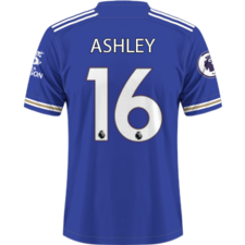
dmayne7 Posted 15 May 2014 Posted 15 May 2014 How about this set for Home, Away and Third? Really nice away kit although maybe a bit too much like Leeds' kit this year.
Harry - LCFC Posted 15 May 2014 Posted 15 May 2014 Why are we obsessed with a move away from a normal blue home shirt? Just because we're Premier League all of a sudden there seems to be this need for something that looks totally different than anything we've ever worn in our history ever, home shirts above all else I think should be sacred in their principles, ours should be mainly blue with white trim pieces (and apparently gold - I liked last seasons kit, but I'd happily see the back of the gold bits) This idea that just because we're owned by Thai people doesn't mean that we should emblazon the hallowed blue shirt with the flag of Thailand, we're Leicester City, Blue and White Army. Fair enough if it's all in good jest but I honestly think some people are actually starting to think it's a good idea. I agree. It's quite possible to have a fairly simple design every year but still be original. We don't to be flashy to make ourselves look different and we certainly don't need to kneel down and worship our owners just because they oversaw a promotion. I appreciate what they've done but there's no need make each shirt look like a shrine to them.
Xen Posted 16 May 2014 Posted 16 May 2014 White instead of gold? Bit of an eyesore ATM Fair enough Edit: Trim on the end of the sleeves is a bit off..
Langley Posted 16 May 2014 Posted 16 May 2014 It'll be the same as Chesterfield's. It has been the last two years.
5_Westwood Posted 16 May 2014 Posted 16 May 2014 For an away/third kit I'd take a modern version of this, I mean we could probably do away with the pocket now. Home Kits something like these, classic Leicester City.

Recommended Posts
Archived
This topic is now archived and is closed to further replies.