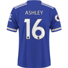
Ashley Posted 22 September 2014 Posted 22 September 2014 Did anyone happen to see the King Power going around the advertising boards yesterday? Possibly a change or branding? Looked something like the above picture, personally I think it looks better than what we currently have.
Chug Laguna Posted 22 September 2014 Posted 22 September 2014 Are slogans allowed? I think the only one I even remember would be "THE WEATHER IN NORWEGIAN" from some Milwall shirt years ago Either way I don't think it looks as nice as now but I'm a sucker for logos
Harry - LCFC Posted 22 September 2014 Posted 22 September 2014 There's a page on it in the programme. "No plans to change appearance of kit this year" but you'd expect it to be on our next kit
Kitchandro Posted 22 September 2014 Posted 22 September 2014 Prefer the current one, myself... Yeh so do I. Having the slogan underneath looks proper wank tbh.
promised land Posted 22 September 2014 Posted 22 September 2014 Prefer the current one, myself... Yes it's a better, clearer font than the new advertising boards one. I did clock all the players training gear has Toyo Tires stamped on it now and there are one or two large adverts on the back of the east stand in between the KP and Walkers ones.
foxfan92 Posted 22 September 2014 Posted 22 September 2014 I don't mind either tbh With the direction both manager and owners are taking the club in I'd support any kit they choose - provided it's not like the female Columbian cycling kit ...
Bryn Posted 22 September 2014 Posted 22 September 2014 Westernised it basically, makes sense. Presumably they'll be looking to expand the business this way sooner or later?
Xen Posted 22 September 2014 Posted 22 September 2014 Westernised it basically, makes sense. Presumably they'll be looking to expand the business this way sooner or later? I get that when the whole of 'King Power' is in the same font as the 'K' it looks like a bit more asian than western, but surely the version we have on our kits at the minute is the perfect way to keep it as it is while also 'westernising' it to make it more appealing to the market over here. I mean, the 'K' logo mark looks absolutely fine, and you don't get much more traditionally western (not the cowboy variant) than a good old fashioned all-caps serif font.
jonthefox Posted 22 September 2014 Posted 22 September 2014 Any sponsorship looks shit to me. Necessary evil of the game today though i suppose.
Jace Posted 22 September 2014 Posted 22 September 2014 As long as it stops peeling off my shirts I couldn't care how they redesign it
FoxInTheBirstallBox Posted 22 September 2014 Posted 22 September 2014 Too early for the new shirt thread surely!!!Although earlier i pointed out at home on the programme that King Power had a new logo on the front. i think it looks quite tidy. but the special K logo looks great
ealingfox Posted 22 September 2014 Posted 22 September 2014 I'd actually grown quite accustomed to that K.
Zapp Posted 22 September 2014 Posted 22 September 2014 i like it, makes the kit look fresh (on ash's mock up) rather than the same logo again
Mark_w Posted 22 September 2014 Posted 22 September 2014 Could this be the end of the highly amusing training kit gag?

Recommended Posts
Archived
This topic is now archived and is closed to further replies.