Silva Fox Posted 15 July 2020 Posted 15 July 2020 Hate it - saves me splashing out another £55 though I suppose!
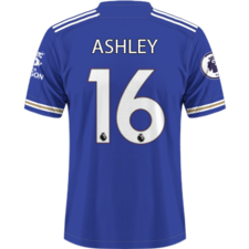
Silebyfox_89 Posted 15 July 2020 Posted 15 July 2020 Someone's had a mare designing/approving that as a home shirt, will need to see it up close before completely rejecting it. Good luck LCFC marketing dept trying to sell that turd of a shirt!
FoxinNotts Posted 15 July 2020 Posted 15 July 2020 I’ll stick with my Stone Island jumper and Gazelles
Samilktray Posted 15 July 2020 Posted 15 July 2020 1 hour ago, Miquel The Work Geordie said: Pretty much my thoughts, folk are acting as if there's an image of Jimmy Saville embroidered into it The overreactions are always the same on this place mate
Hales Posted 15 July 2020 Posted 15 July 2020 It's alright? Not fussed either way. I'm intrigued more by what they are going to produce for the away kit 🤔 I like the pink, not fussed on the grey. Hoping it's not horrendous and neon like Man City's
Nick Posted 15 July 2020 Posted 15 July 2020 9 hours ago, FoxCal said: It’s okay Worst. Collar. Ever 😂
Torten Posted 15 July 2020 Posted 15 July 2020 Looks smart enough, will probably look better once we’ve done the treble wearing it.
Fox in the North Posted 15 July 2020 Posted 15 July 2020 To be fair the 15/16 one wasn’t much of a looker and look how that season ended
Blue and white Posted 15 July 2020 Posted 15 July 2020 Problem with Adidas is nothing is ever a simple design due to their stripes being plastered everywhere. I've always thought Nike make the best low key kits, you only get their minimal logo on the front.
FerrisBueller Posted 15 July 2020 Posted 15 July 2020 It's not that bad, fairly standard. Still bugs me that Adidas don't offer Long-Sleeves.
splinterdream Posted 15 July 2020 Posted 15 July 2020 Just seen this on the hangar shot. Looks even worse 😭
Ricey Posted 15 July 2020 Posted 15 July 2020 Ignore the patch on the left, I assume that's where they've photoshopped something out. I think they've missed a massive trick here. It's ok, but it's too similar to last seasons shirt and it is quite plain. Ditch the gold and incorporate a nice pattern on the front and that could have been a classic.
Jamiebux Posted 15 July 2020 Posted 15 July 2020 Just now, splinterdream said: Just seen this on the hangar shot. Looks even worse 😭 Can you put the close up pic on to ?
sdb Posted 15 July 2020 Posted 15 July 2020 5 minutes ago, splinterdream said: Just seen this on the hangar shot. Looks even worse 😭 Ooo. That ain't pretty.
copunk Posted 15 July 2020 Posted 15 July 2020 Every year some are happy with it, others not, kits never please everyone, I dont mind it
dmayne7 Posted 15 July 2020 Posted 15 July 2020 Actually thought the first one pic looked decent but the second one looks like a Sunday league team's kit.
RoboFox Posted 15 July 2020 Posted 15 July 2020 It's a bit boring, but it could definitely be worse. In fact I quite like it. *tries desperately to justify the inevitable £55 expenditure on one of next years' shirts* Interested to see this white away kit if what @Ashley says is correct.
dmayne7 Posted 15 July 2020 Posted 15 July 2020 2 minutes ago, copunk said: Every year some are happy with it, others not, kits never please everyone, I dont mind it Exactly this. Even more peculiar, is why people are so divided on the home kits every year. After all, you know it's going to be primarily blue with maybe some white and gold on it. The human's perspective is pretty interesting.
Scotch Posted 15 July 2020 Posted 15 July 2020 It's sh!t but it really doesn't matter all that much in the grand scheme of things.
lcfcsnow Posted 15 July 2020 Posted 15 July 2020 At least the stripes are white, the collar is a disaster though. The first Adidas kit has been the best so far.
Ted Maul Posted 15 July 2020 Posted 15 July 2020 I imagine it will look better on, but that hanger shot is absolutely horrendous. The collar is dreadful, it's plain and boring. It would have looked infinitely better if the cuffs were white with blue/gold stripes.
TrentFox Posted 15 July 2020 Posted 15 July 2020 This shirt looks awful. Is it absolutely confirmed? Or is this someone’s mock-up??? 😳😳

Recommended Posts
Archived
This topic is now archived and is closed to further replies.